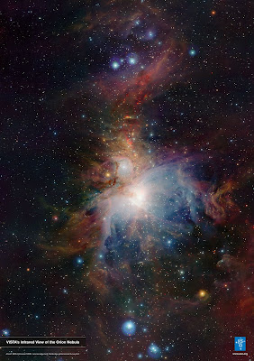
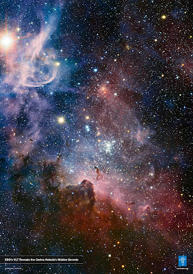
The gathering of influences for the forthcoming animation is exactly what this blog is for. Keep tuned for further developments/updates. These incredible photographs can also be found on The European Southern Observatory’s Website in super high definition. Check it out!
Tag: geometric logo
This character I designed to be a happy explorer of galaxies, travelling through many different layers of stars. This idea was mainly inspired by trains, the song by Air and possibly Astroboy (the hugely popular Japanese cartoon). Keep tuned in for the storyboard development and to see this guy animated! Animating vectors isn’t impossible but always abit finicky, therefore I am first going to experiment with hand drawn (light box) animating. The background will be a mixture of 3D, like the Earth you have seen and some after-effects. I will probably keyframe the character movements to get him to respond differently to different tempos for reactive sound but these will probably follow from the narrative I am hoping to develop in the following week. Essentially the story is about the character’s journey through space where he comes across alot of space-junk which comes to life through his imagination, where he uses the animated, newly found resources to overcome some hairy obstacles on his route. At the moment I don’t think the character is cute enough, I had envisaged him as being quite child-like and small rather than a super-hero. I guess that’s because children are seen as having the most wild imaginations compared to a super-hero, who can only really approach things from one angle, that is the angle they have developed or grown into. The song I was thinking to animate to seen as the animation will primarily be in corresspondance with the music. The background is central to the animation whereby each instrument will be represented by a different form/set of colours. Check out this brilliant but quite outrageous video produced by Jérémie Périn a fantastic young animator, but obviously quite messed up in the head!
^^^^Updated^^^^ A T-Shirt Design I am going to propose to Da Londra. The Magpies are Husband and wife. I want to add a top hat for the gentleman magpie and I have yet to place the branch they are standing on. I think that a hand drawn style might suit the subject better rather than the vectors I have used in this design.
I made this book cover in response to an open brief set by Penguin Books. I used an experimental method of pressing paint onto the page and then rubbing pastel colour across it. The white line graphics provide a contrasting 2D overlay and representation of the word itself “Waves”. I will endeavor to read the book and produce a more meaningful rendition. Coming soon!
Updated Heart Design
Da Londra T’s :D
T-Shirt designs for Da-Londra. Really loving the new Illustrator CS6, finding the interface extremely intuitive and logical. Although having used the previous version of CS4 I guess it has not changed that much. The colours I have used here are not the official T-Shirt colours, which I am guessing will be something like fruit of the loom colours, but it definitely showed up some of the possible printing dangers that might occur i.e. clipping and spilling! Hopefully the bike in this instance should be simple and bold enough to avoid these problems, but if not I will definitely have to reconsider my approach to this one! Check out the selection of products here: www.dalondra.com

Comic strip stylee deck designs I was asked to produce by Faltown Skateboards. I used ‘The Rasterbator’ (an online image processor that can create huge dot matrix images) to fill in the dark patches of a photograph taken from the Hubble Space Telescope (hope the copyright is not too tight). This hopefully helps to fuse together the bold vector graphics with the background.
I also like this effect because it massively simplifies and vectorises the background, contrary to the infinite nature of the subject (space) giving an interesting juxtaposition. This technique was mainly inspired by comic book print patterns and also the video, Parachute ending, directed by Will Sweeney and Steve Scott. Check it! (if you dare ;/) Also check out Scott’s website http://www.stevescott.com.au/


