Tag: geometric logo

Globeman Brand

I was asked to create a sub-brand using the Globeman figure. Recently departed from Lycamobile, Globeman was key to spearheading a competitive market and was originally conceived by David Ogilvy’s design house. Since then, Globeman has been subject to ridicule, also as the mascot approach to branding has since been overtaken by elemental styles and colours.

Lycamobile artwork to appear on the side of a SIM card vending machine in certain Irish boutiques.
The aim is always to give the least stress possible with these kind of screen designs and all outdoor in my opinion. I often try to put myself by the side of the viewer in these instances to add a site-specific touch and an appreciation that the advert will be relative/harmonious to/with to it’s surroundings.

This design was inevitably complex mainly due to the product manager adding comms/features along the way, but I hope that the beautiful colourings and geometric forms culminate together to give a warm sense of security (the sun) combined with a deep, fascinating blue of the sea leading to a clarity in the white elements (the communications). I really love how deeply you can associate with the simple geometric forms and colours on a base level that hopefully undercuts all of the other advertisements on the market that seek to grab attention in different ways. The design shouts out at you but in a beautiful way! It’s like how Kandinsky would have seen the Opera.
For me, seeing this design evolve in-house over a period of about a year was a fascinating journey and I feel that this combination of efforts has led to an intriguing and well balanced outcome in the above. Thanks largely to the efforts of Robin Sutherland (Head of communications Lycamobile) and in it’s initial conception, Alvaro d’Apollonio (graduate of Central St.Martin’s college London) we have combined a deep sense of harmony using the simple geometric forms and shapes found in nature (i.e. the sun, sea and a tree/download shape combo) and also a strong centerpiece using the striking contrast of the bright pink to yellow gradient, whilst still getting the message across in the clearest form of White Helvetica font, which was the clearest possible choice against the other strong, competing elements.
I look forward to animating the above hopefully in some subtle ways that speak to the customer on his/her terms, not as an attempt to hijack his/her conscious and more often than not, carnal desires, as so many adverts seem to do, almost insulting the customer and treating him/her basically like animals.
Myself and another lead designer were asked to make a proposal for the upcoming 4G launch in Australia. I took alot of time in balancing the imagery and enhancing the background to give depth and a conceptual edge.

The combination of the headline and the Chinese characters (denoting the rapid speed of the 4G bandwidth), the heavy glow effect in the foreground, the mathematical style architectural drawing and the rocket overlay on the side of the building which I integrated to bring an added depth and also a homage to one of my favorite films “Blade Runner” or more recently the “Blade Runner: 2049” sequel.
MEDIARITE MKII
MEDIARITE


I was approached by a friend to create a covering for an eco-friendly cardboard hanger he wanted to pitch to Cyberdog (a futuristic cyber-goth shop in Camden). I was really excited to be involved in such a forward thinking project, especially having seen the 3D version of the hanger which was really something else! I can’t wait to see these mocked up!
Two Character turn-arounds from the forthcoming animation. This is the first stage of the pre-production process and will be referred back to when animating. It also helps to give more depth to the characters, making them more believable. Another way of doing this is to write a detailed biography for each character (to follow). Keep tuned for the storyboard and music track which I have decided to conduct myself using Ableton Live.
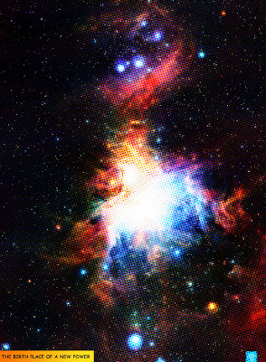
Check out this comic book style effect on the ESO images I uploaded. It is meant to mimic the tiny priinted circles you find in comic books and posters. It was made simply by duplicating layers in photoshop then using the colour halftone filter to darken the original layer. There are so many variables in this technique you can get it to look exactly how you want it to. I really like this technique of combining many splodges to form a bigger picture. It is sometimes reffered to as divisionism or pointillism as an impressionist movement practised by many painters in times past. It is still used in printing whereby varying densities of CMYK (Cyan, Magenta, Yellow and Key) dots are used.

