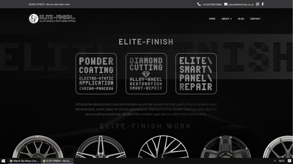
Recent small-business online presence including SEO optimisation and logo redesign. Animated landing page with scrolling alloys GIF (CSS property = overflow: visible;)


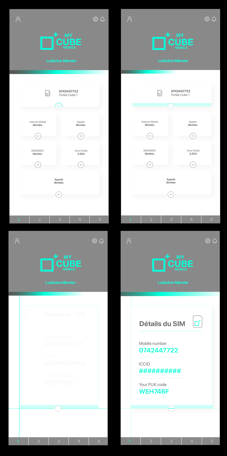
I have recently been working on a white-label service developed in partnership with Lycamobile. My opposite number in Switzerland, Jean Rodriguès, has been art directing the project and gave me a good starting point in-keeping with his vision which I was able to adapt using Adobe XD.
Adobe XD is a very powerful and free UI/UX layout tool for designing website and app UIs (user-interfaces) inn a very simple and intuitive fashion, similar to Sketch. An especially nice feature of XD is the use of art-boards as frames and by utilising the “Auto-animate” feature in the transition type, you can control almost every aspect of an animation from one screen to another when prototyping so that any developer can either interact with, view a video of, or even export UI elements from as CSS classes or SVG vector animations. XD visuallises this in much the same way of nameclasses whereby the software predicts the frames between each art-board (so long as the animated element is named the same on both art-boards). The potential becomes even more apparent when plugins can even allow for exporting as React Native code.

I was asked to conceptualise a logo for a recruitment and training startup based locally, here in London.
Having read the brief, I wanted to create a simple yet effective brandmark that would constitute a trustworthy, reliable style that would lend itself well to an app icon for the future development of the business. I chose Orbitron as the logotype as it met the criteria for the brand and melded well with the brandmark when I placed them proportionally next to each other.
The overlaid shapes are all in exact ratios to each other according to the golden ratio (1:1.61803398875). I also added the drop shadow to differentiate the two main shapes and give some depth/dimension to the brandmark.