An example of a 3D ad made in Flash displaying live hits on the host website. This is just a small feature of the website but it shows that information can be harnessed directly into the a 3D display for informative purposes with a variety of data variables. I can see this being harnessed within advertising to shed light on a company service like Lycamobile’s. i.e. To give live rate feeds for each country we service.
Category: Uncategorized
Universe Sandbox
This hugely impressive gravity simulator game founded by Dan Dixon nearly 18 years ago has jumped leagues since I first came across it in 2008. It predates the hugely popular Kerbal Space Program and is definitely for the more discerning astro-physicist. The newest version of the game has been re-written in Unity, a Direct3D and OpenGL utilising library. I am currently developing a project that may be able to piggy-back the project as an MMORPG, so watch this space on kickstarter.com!
Web GL Globe
Here is the future of internet browsing whereby browsers tap into 3D video processing for a truly remarkable online experience. If this technique could be wielded it could provide instantaneous interactive information for users to gain a broader insight into a company’s business or indeed data visualisation which would help people to make more informed decisions on a day-to-day basis. What is even more impressive is that google has managed to get this working with mobile devices! The applet uses a combination of three.js (javascript library) and HTML to achieve fluid motion graphics that do not infringe on the your computer’s processing power!
“The primary challenge of this project was figuring out how to draw several thousand 3D data spikes as quickly and smoothly as possible. To do this, we turned to Three.js, a JavaScript library for building lightweight 3D graphics. For each data point, we generate a cube with five faces – the bottom face, which touches the globe, is removed to improve performance. We then stretch the cube relative to the data value and position it based on latitude and longitude. Finally, we merge all of the cubes into a single geometry to make it more efficient to draw. The second challenge of the project was animating the globe – we wanted it to be fun for the user to manipulate. Thanks to WebGL, we’re able to display thousands of moving points at high frame rates by using the user’s graphics processing unit (GPU) for 3D computations. Each state of the globe has its own geometry and we morph between them with a vertex shader, saving precious CPU resources. Additionally, to make the globe look nice, we took advantage of the possibilities of GLSL and created two fragment shaders, one to simulate the atmosphere and another to simulate frontal illumination of the planet. Now that we’ve released the globe, we’re hoping that developers like you will create your own. What data will you show on it? If you’re feeling inclined, you can learn more about the data format (represented in JSON) and get the code here. If you create your own globe, please also consider sharing a link with us — at some point in the future, we hope to post a list of interesting globes that have been submitted.”
[Source: Google Code Blog]
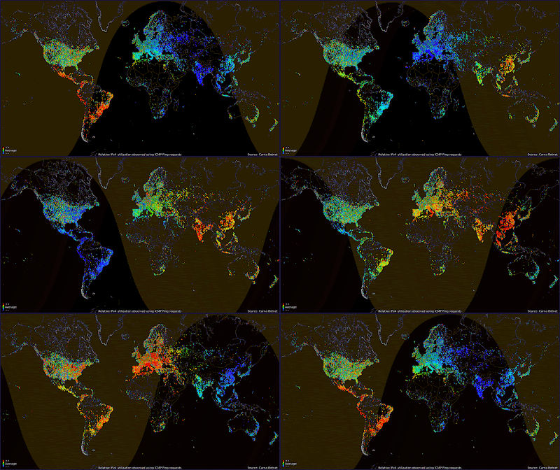
If you were Unable to view the OpenGL Data Visualisation, here is a still of the render.
World Internet Usage Map
Nicholas Lichtle – Anodine
Stunning motion graphics, indroducing Anodine, a preset animated font for Adobe After Effects. Very stylish! The colours also work really well with my own blog header!
Nicholas Lichtle – Good Luck
Extremely beautiful and minimalistic sound reactive video!
LM Dynamic Banners
Here is the result of many hours of working towards a dynamic banner system whereby text can be imported into the animation above. The flexibility of this system should outweigh the complex process I have undertaken to accomplish these banners whereby the templates, copies and some assets (like flags) can be changed extremely readily and also providing keyword access to search engine spiders for web optimisation. UPDATE:: The banners have been received well in the USA showing overall impressions of 3,000,000 and an average click-through rate of 0.17% which is 0.1 above the industry average of 0.07%, thats roughly 5100 click-throughs in only 2 weeks! The strategy was rooted in making the banners subtle yet noticeable as part of the user journey through the web. This also has the added benefit of not annoying the customer and therefore not tainting our reputation with him/her. It is really satisfying to know that so many people have acknowledged and gone on to make purchases through the advertising channel, and really brings some value to the effort I have put into conceptualising and implementing the dynamic banner campaign.
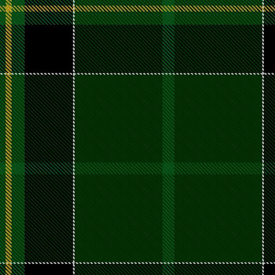
Duffy Tartan
Flagman Returns
The latest edition to the Lyca concept artwork reel. I wanted to inject some life into the story behind Globeman. In this case giving him an arch Nemesis called Flagman. It is really just some in house design eccentricity but hopefully one-day an idea like this might be taken seriously and could go Global! The original image was taken fro my favourite website http://www.eso.org and from here I overlayed and edited aspects to create the Globeman/Flagman movie style trailer image.
Check out the Matrix rip-off (below) I put together in the same spirit. That is to give some background to the usually hollow template of a corporate brand, which often stagnates in not evolving. If there is one thing I have realised in the corporate business, the most effective way of not becomming overwhelmed by the sea of markets and other competitor’s efforts is to make the waves yourself and ride them into the shore 😉
Initially I thought this could have been netting with material suspended but I was wrong. It could have been to do with a mention of Banksy stencilling techniques from Jake Wells; a fellow admirer of street art. But no, it is indeed just immaculate drawings with stark contrasts that at a second glance, perhaps appear as a flock of birds, leaves in the wind or even just a face in the clouds. The awesome spectacle that is our sky deserves the attention of wonderers and provides insight into meteorology. This backdrop is combined with bold strokes almost etched into the sky. The Parisian architecture frames the whole thing beautifully and interactions between the subjects and this energetic street environment is splendiferous and achieves an awesome city feel with a continental vibe I personally love. It reminds me of some sketches I made of Plaza Villa de Paris near Colón, but the characters in this are really well portrayed, I think perhaps not even to likeness of people. These characters tower over the scene in an almost godly way, but also reflect the image of the artist Lamadieu. The real success of this idea is the canvas which challenges the rectangular format we are so used to seeing as picture-frames and screens. It works on many different levels but the most intriguing for me is the contrasting nature of the subject’s person and the infinite nature of the backdrop, which could be seen as a representation of out existence in the city environment.


