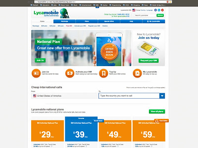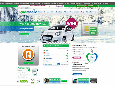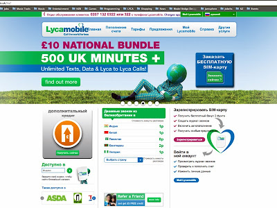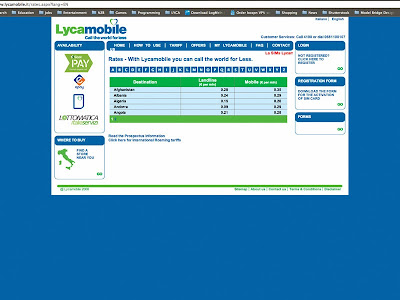
Recent concept and wire-frame for landing page to drive traffic to the Lycamobile site and improve customer retention.
Category: Uncategorized
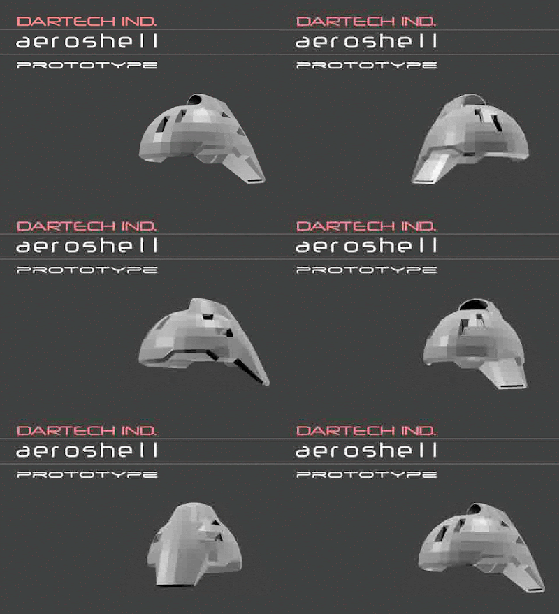
Dartech ind. aeroshell ™
Super Globeman
I was asked to produce an animation to elaborate on the Super Globeman concept I have been developing for Lycamobile. Hopefully this style should lead the brief given to the creative agency working towards a TV advertisement. click here for the fullscreen version.
Super Globeman original concept art
Below shows the storyboard Creativitea have come back with:
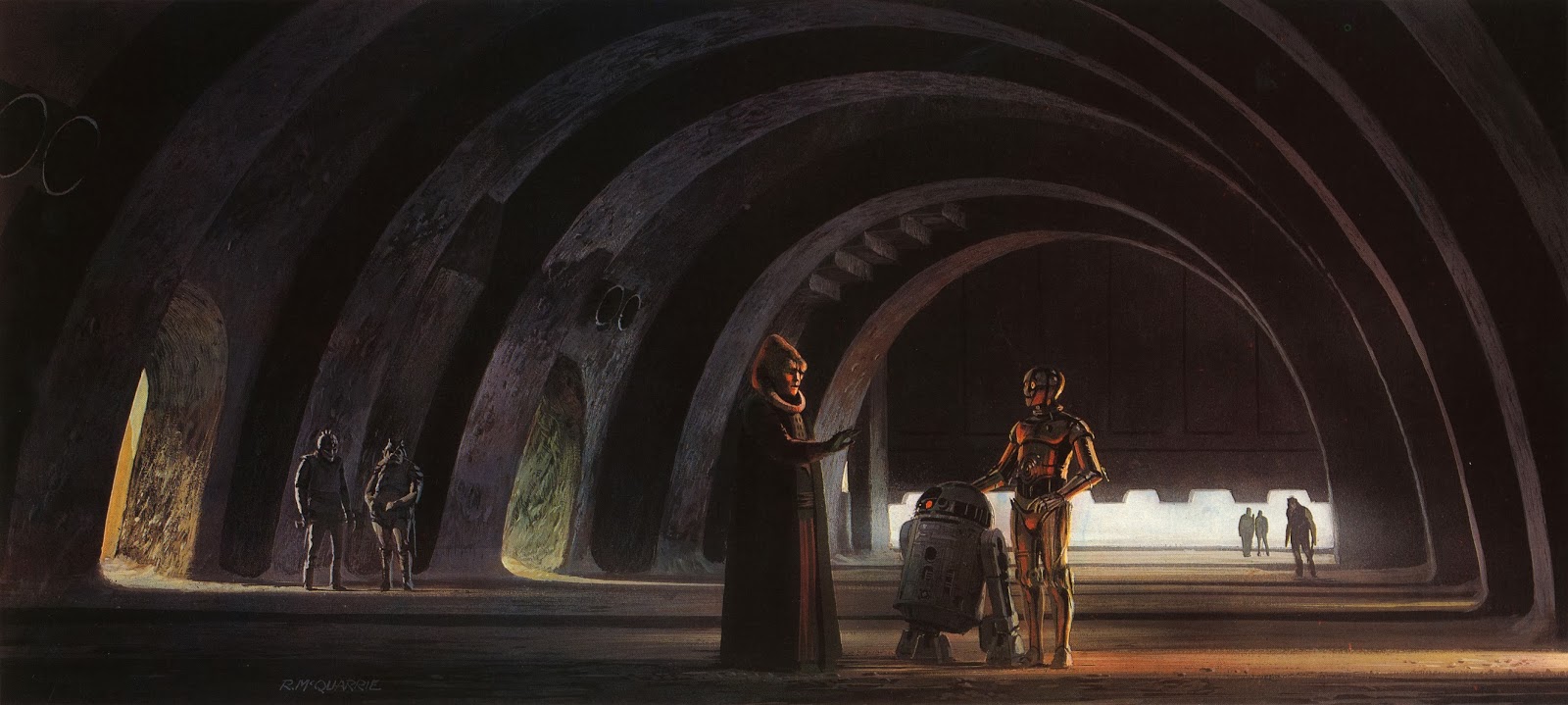
Ralph McQuarrie – Jabba’s Palace
I was insipired the other night by watching the third Starwars film (Episode IV Return of the Jedi 1983). The set design and cinematography from one of the opening scenes gave me a very immersive feeling of actually being in Jabba’s palace, or perhaps another place I have been, where space and light was used exceptionally well. The above drawing by Ralph McQuarrie was very closely followed by the set designers who also added in their own details, like the strangely reflective and hollow locking teeth on the door and corridors leading to unknown places. The long arches and sandy textures seem to come from a Moorish influence and definitely give a sense of being cool in a hot climate.
I find it incredible that so much space can be portrayed through the window of a TV screen. I want to challenge myself to create my own fantasy interior to hang on a wall, as if a window to another world. The window itself will become crucial to this and should tie in to the theme of the interior.
Most importantly I want to convey a strong feeling associated with something pleasant, like in the instance above, giving a feeling of nostalgia from a strong sense or emotion.
I also want to convey a series of futuristic interiors, similar to that of the Jedi temple in episode III where massive pillars give a great sense of space and light. In order to do this I plan to visit some of the larger cathedrals and churches in London and see if I can modernise the cold stone of the walls, playing with textures and forms that could one day be formed from futuristic, programmable materials through the wonders of nanotechnology.
Lycamobile Site Evolution
Festive Banners
New Lyca Dynamic Display templates
I recently was asked to refresh the dynamic display ads for Lycatel across all brands. Here is the basic design/animation I came up with. By making the ads as flexible and simple as possible I hope to bring the content to the forefront and keep the weight to an absolute minimum without compromising quality of image (all adhering to IAB standards). Above are a few examples of the new design that draws text from an XML feed using AS3:
Google little animation.
 I was really inspired by this very simple animation from google. On the browser background I am using it gave me a sense of planetary bodies moving in space. The branding here is also excellent, using the google colours and giving a sense of dynamism and perfection. If you look very closely at the animation you can also see tiny extensions to the planets that look to be orbiting each of the circles. It also reminded me of a previous post made called “minimal lights” when you can see them here. MINIMAL LIGHTS
Spreadshirt
A friend of mine recommended using this printing service to create one off designs (http://www.spreadshirt.co.uk). Check out the prospective look of the shirt!
Symbolic Patterns
Triptych symbol combining three individual patterns inspired mainly by the Metatron cube (flower of life)

