Categories
Uncategorized

Exeter Animation

Having being briefed on the animation festival, and having seen past year examples, we began brainstorming ideas for a short 30 second ident. One of the first ideas that was put forward with some conviction was Ben’s “Coo-coo clock”. The idea of clockwork seemed to fit in well with the festival and furthermore an opportunity to develop a character in the coo-coo bird. We then learned that through Ralph’s local knowledge of Exeter that there stood a statue of a phoenix outside the main theatre of the festival. This seemed to reinforce our direction and we decided to go away and develop the visual style and any of our own additions. Initially I had envisaged trails of solid colour behind the bird after it left the clock. I put this forward in our next meeting, and was given the task of depicting the scene after the phoenix had left the clock. November the 5th passed and through some spectacular fireworks I was inspired to depict the ending scene as an explosion of colourful fireworks.

I began to work out the technical viability of the final scene, and realised quite early on that the surrounding environment i.e. the clock tower. would need to be lit up in time with the explosions. This was not necessarily a difficult effect to achieve, but I felt it would be vital in making the scene look believable.

Meanwhile I was also developing the background landscape for the opening long-shot. I imagined a fantastical and vivid combination of simple lines and colours. Ben also had a strong idea of the kind of style he wanted and I tried to take on board his envisagement by studying some references he gave me, such as the early 20th century artist, Ivan Bilibin. Strong and colourful patterns and a very distinctive colour palette used by Bilibin would certainly give the vivid and almost mystical style we wanted.

Initially I put together a basic layout of the landscape, just to assemble some structure and composition. We decided to create a library of elements that we could then layer up in photoshop. I felt this was a good idea at the time as it would allow us to chop and change the background as we pleased. However, In the end we decided it would be much easier to put all the foliage together into one slide. Using Holly’s developmental drawings and some of Bilibin’s organic patterns I compiled the foliage like this.

I also had the idea of including a waterfall, which I had learnt to do from a Starwars documentary on the special effects used, by filming sugar crystals on a black background. The end result was extremely satisfying, but when putting together the background I decided that the rock formation required to house the waterfall would not really look consistent with the rest of the landscape. Nevertheless, below is some of the raw footage from this experiment.

My first drawings that included a few tors (rock hills) that I felt would be recognised as an Exmouth landscape, were not really in keeping with the style of the animation or Ben’s vision. I found it quite difficult to adapt my style of drawing for the ident but I think that it came off quite well in the end and looks very stylish with the abstract sky and clouds.

This also made me realise the problem encountered when working with a number of people on the same animation, when a team effort is often required. That is, trying to keep a consistent style throughout the piece, even though numerous people with different styles will have been working on it. I suggest that great importance is given to the segregation of the animation, and which bit is given to whom, and whether it should be separated scene by scene or into small details, as we tried to do with the background elements. I know that in the film industry, people are employed specifically for the job of making things consistent throughout a film i.e. a continuity adviser. By using the same colour palette throughout and comping the animation together with the same filter the differences in styles should not be too noticeable. Unless of course we are looking to emphasise the different styles that can be achieved through animation, using different types of animation i.e. 2D, 3D or stop-motion. This is something I will have to quiz Ben on when comping the animation.

Overall I think that when it eventually comes together the animation will look great. It had been a long and winding road with some confusion about what type of shots were required but this was inevitable with a mixture of animation methods.

Categories
Uncategorized

Human perception and beyond

For some time now I have been exploring the idea of the role of sound within animation. I am also exploring the idea of harmonisation between sound and light and what the outcome of this may be. Both natural energies have a spectrum of frequencies which the human brain is able to pick up and interpret. Music can be sectioned into specific wavelengths using an equaliser. Conventional music visualisers also use an equaliser by measuring the amplitude of each frequency then relaying them as a graphic line or bar. Visualisers use algorithms (mathematical equations) to translate sound measurements, sectioned into layers, into graphical images.


Magnetosphere revisited (audio by Tosca) from flight404 on Vimeo.

The new Itunes visualiser, “Magnetosphere” is a briliant example of a 3D equalisation, algorithm, music visualiser.

Although a graph is arguably the simplest and clearest form of displaying data, I am also sure that it is not the most immediately understandable visualisation of information. In an attempt to find new ways of visualising sound I have begun to explore the possible parallels between sound and light, and although I am not sure it is scientifically feasible to compare two different sensory elements I feel that these links might provide a more immediate recognition of sound, through light:
<>=is to

Stroke/beat <> Mark/line (or at origin through chemical reaction)
Note/Freq. <> Colour (wavelength)
Tone <> Mood/ lighting (Overall)
Amplitude <> Contrast/weight
Tempo <> Movement (in relation to background)
Stereo/panning <> Dimension ie. 3D

Also the way in which sound and light is echoed and reflected by physical matter is quite similar, although far more important for perception of light. It may be quite interesting to experiment with sound echo and how much the initial sound can be changed.

In the simplest terms what I am trying to develop is the possibility that:

Waveform <> Form ie. Shape.

Theoretically, if these properties could be synchronised, I am hoping that a harmony of sound and light can be reached, or possibly a fusion. It is difficult to know how or if the human mind could even be able to experience such a thing but I am hoping to gain some insight into this through the study of a condition called synesthesia. Kandinsky, possibly one of the most famous artist’s in history with the condition, painted many abstract soundscapes. He named them after the symphony or piece of music that he interpreted.

Another well known synesthesiac, Richard.D. James, better known as Aphex Twin, whos complex, layered symphonies have often given me great inspiration. He has also bridged the gap between sound and light, using an electronic spectrometer . James often uses his own face in music videos often in an extremely sinister and vile context, contributing to the dark image he has developed.

Interestingly the face is possibly the most instantly recognisable and communicative forms to the human mind, however it is simply a reflection of light, not a light source.

The above video shows the incredible feat of creating a recognisable visual image through sound, translated by the electronic spectrometer. Although it is extremely haunting, I feel it is a breakthrough in the field I am looking at. Even though it is just effectively lines on a graph, sound-engineered to look like a face. It makes me wonder if James used drawing tool that translates spectrometer lines into sound, but as he is a sound artist I guess it is probably the other way round.

Another collective of artist I have come across in a similar line of work is the graphic depiction of magnetic fields on a filmed background.

One of the first people to demonstrate the shape of a magnetic field was the scientist Robert Hooke. Using iron filings placed around a small magnetic ball, he hoped to demonstrate the shape of the earth’s magnetic field. Magnetism is a prime example of an energy/force that we cannot see but we know is there. It is only through the medium of another material that we are able to see what it might look like. This animation produced by Semi-conductor films demonstrates how magnetic fields might look if they could be seen. This links together with my idea that different types of energy can be somehow related and visualised into what we can see. Detailed research was conducted by the collective into how magnetic fields behave then illustrated as lines of energy, mainly through interviews with various experts in this field. Not only is the artwork interesting to look at, obviously with some aesthetic consideration, but also might serve some educational purpose in demonstrating to budding scientists how magnetic fields look. Whether or not there depictions are accurate or not is debatable, but the work is more impressionistic rather than an actual diagram of measurements.

Categories
Uncategorized

Timing within animation

Since our exercise in Audition and the emphasis made on timing within dialogue, I have recognised how timing effects a scene within animation, especially within comedy. Watching Family Guy, not usually noted for it’s animation, I began to think of each scene of Family Guy as a song or music album. Let me explain. A work of music usually opens with something to grab your attention, a sound rhythm to engage and excite (or perhaps something well renowned, that the listener can be immersed into). The second song usually begins with a catchy, characteristic tune, further engaging and immersing the listener, usually definitive of the album as a whole. Having set the mood for the rest of the album the artist can kick off the journey of the rest of the album. This may consist of a series of waves, peaks, troughs and plateaus. Inevitably the final song will reach the pinnacle then disband to leave the listener with a final thought. Alot of the time the beginning will re-emerge giving the album a circular property that echoes on, as a complete work. Finding parallels between an animated story and a musical masterpiece may be quite far fetched, but there again some similarities are apparent.

Categories
Uncategorized

Soundscape Project

I was extremely happy at the prospect of creating my own story, told through sound, without dialogue or visual reference. Having previuosly done quite abit of experimentation with sound recording, I felt confident that I could find some interesting sounds to include in my story. The workshop given to us on the different types of microphones and their directional sensitivity was also extremely useful for this, especially the point made about the importance of microphone placement. I.e. Getting the levels as loud as possible in order to get rid of white noise during editing.

Bearing this in mind and having a rough idea of the story I wanted to portray, I set out to the Falmouth Marina. I began by trying to record the clanging of runners against the masts of yachts, as I felt this gave alot of atmosphere and would be immediately recognisable to listeners. On the marina jetti I noticed the sound of creaking ropes and water lapping against boats. Having managed to record a few good quality sounds I decided to call it a day, but on my way out I discovered an absolute folley goldmine just behind the Maritime Museum. Reams of interesting sounds from metal pipes to blocks of wood, discarded gas canisters and oil drums providing deep ringing sounds. Also, just something interesting that I noted whilst hitting the drums was the water that had collected ontop of the drum, and the pattrerns that formed from the vibration of the stroke, known as the natural phenomenon of cymatics.

Here is the finished soundscape:

Categories
Uncategorized

Sound

As of late, sound within Music (particularly electronic), film, voice and the overall tone expressed by an artist’s style has become an increasing fascination for me, and something that I allow to take me on a journey of feeling and imagination. On the other hand, through being introduced to the science of sound design I am also compelled to dissect and critically analyse every aspect of someone’s work, but this also comes with the ability to perhaps understand a little more about what the artist intended as aposed to my own interpretation.

By nature sound and music in particular are extremely subject to the person who is hearing it’s ears and interpretation. Its is also the most penetrating and awe-inspiring of all mediums of art. A scale of notes is only recognisable from the notes that preceed it. But this is only for the means of measuring it. A note/pitch/key is something very consistent, yet the human reaction is infinitly different from person to person and from moment to moment, Timing within music is crucial to its effect on the listener both within the piece and the time at which the person is listening to it.
For me, animation and sound are an awesome combination when they work well together, sound effects however are almost always only there to reinforce what we are seeing and often to go un-noticed, allowing the visual aspect to take the lime-light. Only recently have I been introduced to the idea of animation following the lead of a sound effects. Productions that comprise of script led stories and sketches like Phone Jacker, are examples of how animation is used (literally) to emphasise certain words and points. Another example, and a personal favourite of mine, is the work of Ben (Yahtzee) Crowshaw whos fantastically prolific rants about computer games are backed-up with simple and blunt diagrams of literary anecdotes and idioms which emphaisise his words to great effect. Of course the, animations on their own would seem slightly crude without the diaglogue that they are supporting. Nevertheless this shows how sometimes the visual aspect can take the back-seat and still be very intreguing to the viewer.

In short I guessthat the ultimate aim of the animator is to use both sound and image harmoniously so that they can both spiral up and take the viewer into a believable world of their story. As a viewer/listener we want to be immersed into the plot and loose ourselves in the alternate reality of the story or anecdote. Therefore it is the job of the animator to keep the viewer immersed in their plot.

Categories
Uncategorized

Animation Idea

As a development of my Jester character I came up with last year. I wanted to look further into the idea of live performers as cartoon characters. This would allow me to ground myself into the relative field of stage but with an extraordinary twist.

The acrobatic twins shown above could be one of the acts, performing incredible feats of agility and balance. The oppurtunity to play around with choreographic shapes and effects is also quite exciting. In addition to the performance I have also been developing an arena for them to perform in. Using Maya I knocked up a rough shape of the arena from a sketch I had made previously. The idea of creating a whole environment in 3D is quite daunting but the possibilities for balconies and seating is unlimited, aslong as I do not deviate too much from reality and function.

Categories
Uncategorized

Folley Progress

Having spent alot of time experimenting with a microphone I have come to the conclusion that capturing the actual sound of an environment is near impossible. Numerous times I have tried to record the sound of the sea, but among technical difficulties I found it was extremely difficult to capture sounds in the same way that the human ear does.

In this I realised that the best way to give the impression of the sound you are trying to record is to substitute the sound of other objects then master them. For the sound of the sea I managed to find something to recreate the sound of crashing waves in my bedroom by rustling a sleeping-bag. I then dubbed this over whitenoise to give some depth, and the result I have posted below:

Categories
Uncategorized

MARK: Graphic arrows

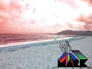
Here is the first mock-up of the graphic parts of the intro which will cut through the placid background:

Categories
Uncategorized

MARK: Folley

Aswell as the visual side of the intro, I began recoring sounds using a rifle mic for the atmospheric sounds of the beach. I find the sound of the waves crashing on the sand and rocks extremely refreshing and awe-inspiring. It is also something I think someone in an office might appreciate, being trapped in a dingy office all day. I think sound would be a very worthwhile on the naturalistic side of the project. Here is a rough example of the kind of sound I mean.

It would also be good to have a sound effect for the graphic arrows as they move accross the screen. I am sampling various things at the moment from metal to pipes, but I feel something with a very soft ringing resonance would fit quite well, or possibly a swooshing sound.

By taking a small section of this sound and adding filters/distortion I should be able to get the sound for the arrows.

Categories
Uncategorized

MARK: Development

Aswell as the animated arrows idea, I thought it might be interesting to also have a photographic background in contrast. I felt this would also give some feeling to the animation in the style of Cornwall. This is an idea that I knew Ralph was also developing for the project so we set out for the beach, photographing and sketching the many things you find on the beach, and looking at the possibility of animating them.

Here is the graphic mock-up we sent to MARK:

I took a multitude of shots from the same point in order to make a panoramic, by collaging the photostogether in Photoshop. I think that the end result is quite striking, and give a perception of quite a wide perspective. Also the spherization of the horizon gives alot of depth. From here I began to super-impose objects I had found onto the beach. The form of driftwood, was one I found to be most effective, because of it’s unusual shilouette and texture.

I am constantly looking for ways to develop the beach background further. The idea of having objects you might find on the beach scattered along the sand would provide some interesting forms and perhaps encourage the user’s inquisitiveness.

The objects that I have thought of using are: Driftwood, seaweed, Ice-cream, surf-boards, a bottle (with message), people, dogs, flags, rocks, sand-castles, seaguls, boats, origami boats.

I also thought it might be interesting to develop an interactive element with the objects. Perhaps they could move slightly when the user hovers over them; or perhaps the perspective could change when they click on an object, zooming in on the texture of the object.