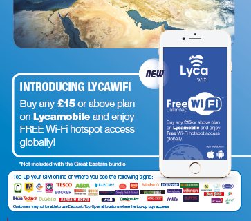
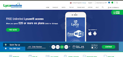
 Lycawifi is a white-label product allowing customers to use a global hotspot network with over 60 million access points worldwide. I was happy to be assigned this project across all channels as when I found out about it I was very impressed with the offering from Lycamobile.
This addition to services is an important step in adapting to a dwindling Telecommunications market. However, the value added is a very shrewd movement towards what I believe will be the future of the market in years to come. I.e. Mesh networking powered by user enabled devices.
I tried to keep the image on brand and as simple as possible whilst generating the interest in the new feature added to existing products. In order to do this I used as much imagery to identify what the product actually is instantaneously recogniseable to the customer. E.g. The WiFi logo on a phone screen (denoting that the advertisement is for an app).

