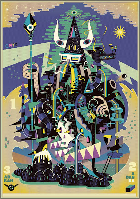
I have been exploring the work of this illustrator/animation director recently and really taking a liking to his bold, colourful, surreal style. This is just one of his many illustrations. What I really like is the way he exaggerates certain aspects of the human form and also the way each of his paintings is almost a microcosm of narrative. Above is a prime example of this, entitled Abrah Ka Dabrah. Again I urge you to check out the rest of his work at www.stevescott.au if you like this kind of style also check out Laboca design house and Will Sweeney who all share the technique of using stark, bold lines and colours to depict slightly mind-bending subject matters. Also check out the latest music video for Birdy Nam Nam produced by Scott and Sweeney! It really is quite mental, but a brilliant rendition none the less, encorporating many different forms of animation from 3D to hand drawn. I really love the concept aswell!
Category: Art
Categories
LINK
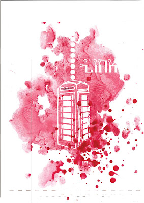
A homage to post boxes and the bright red colour they brought into our lives! I used a combination of watercolour and illustrator to produce the effect of the red colour being displaced by the heavy looking phone-box. It is also perhaps playing on the idea of the Doctor Who tardis (Time And Relative Dimension in Space, police-box) probably actually closer to the Bill&Ted time machine! Excellent!
Categories
Spirographic
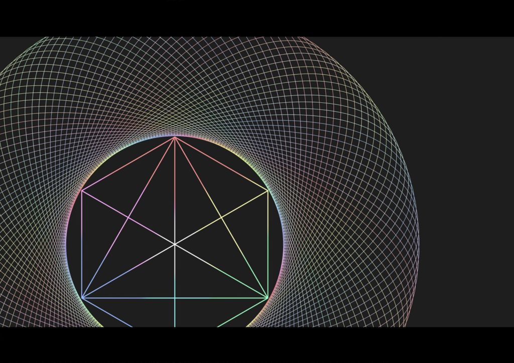
Although this is quite a primitive example, I am interested in persuing some pattern combinations that give a psychedelic appearance when put into motion. I think spirograph looks alot cleaner and nicer when it is a still image. Below is the finished example of the concept art I am putting forward to be animated.


