Author: adarabi

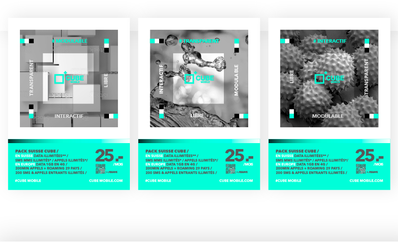
Cube Mobile Posters

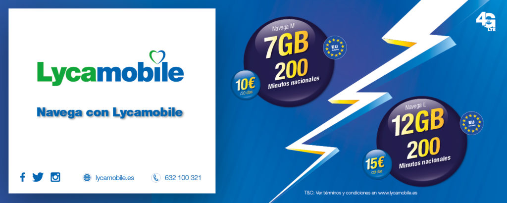
Campaign landing page refresh including style sheet assets for the developer to integrate to his/her own CSS library

Star Poster
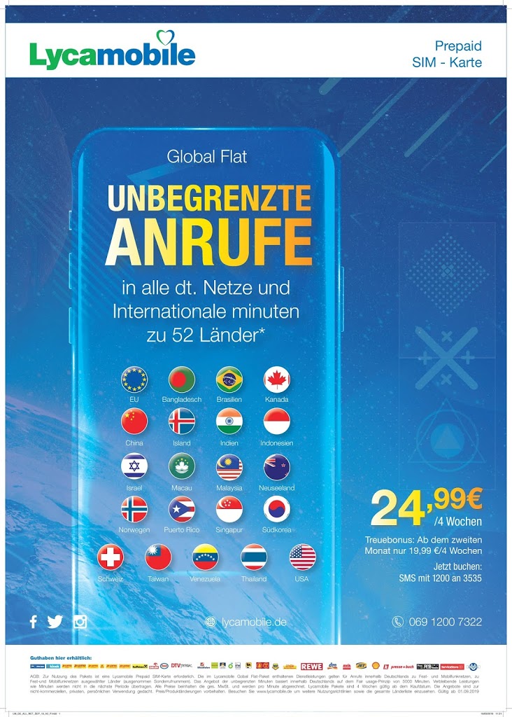
In-house assets compiled to communicate to German Lycamobile customers usually placed in newsagent shop windows
I compiled a multitude of effects into this Background all attributing to different experiences recently endeavored and also through some knowledge gained in a stellar tour given to me by a close friend. By warping starfield planes, using different overlays to enhance this stellar-scape and somehow find a way to integrate the content with the background. This case a futuristic HUD vector illustration perhaps controlling some futuristic spaceship or interface I hope not only utilises the empty space but also sits outside the frame of the margin to further this effect of a kind of terminator or predator UI.
Globeman Brand

I was asked to create a sub-brand using the Globeman figure. Recently departed from Lycamobile, Globeman was key to spearheading a competitive market and was originally conceived by David Ogilvy’s design house. Since then, Globeman has been subject to ridicule, also as the mascot approach to branding has since been overtaken by elemental styles and colours.


LM SA Leaflet Design

Recent artwork produced for Lycamobile South Africa. Using the current print-artworks as a bridge to the new concept (previous post) so the transition is incremental and not so unrecogniseable as Lycamobile to the customer. By seeing the posters everyday it is tempting to want to change the designs too often. From the perspective of an in-house designer t seems like the brand is evolving from one week to another yet from the customer’s perspective it may seem very inconsistent and sporadic (due to the frequency of exposure). In order to overcome this, we have sought to maintain the consistency through the branding elements I.e. Header with brandmark, this at least shows we are still the same company known to the customer. Without consistency, the brand becomes diluted and weak, with no personality or tone of voice. This s why most brands opt for the agency approach, whereby one consistent look and feel through copy, design and colours is carefully selected in order to reflect the target audiences’ needs and wants as well as the strategic positioning of the business. This design is then built upon (evolved) very gradually over the course of time so as not to stagnate and become old. As I have shown with the post sighting Doyald Young’s Prudential re-branding even the leading on the character of the word mark can effect how it is read and therefore the vibrancy/fluidity of the brand. By maintaining this style throughout all advertising and collateral we can make sure that the customer is building a relationship of trust with the business (represented by the brand) and doesn’t get confused with greatly varying styles, fonts, colours etc. This will only lead to brand confusion and a dilution of the desired response.

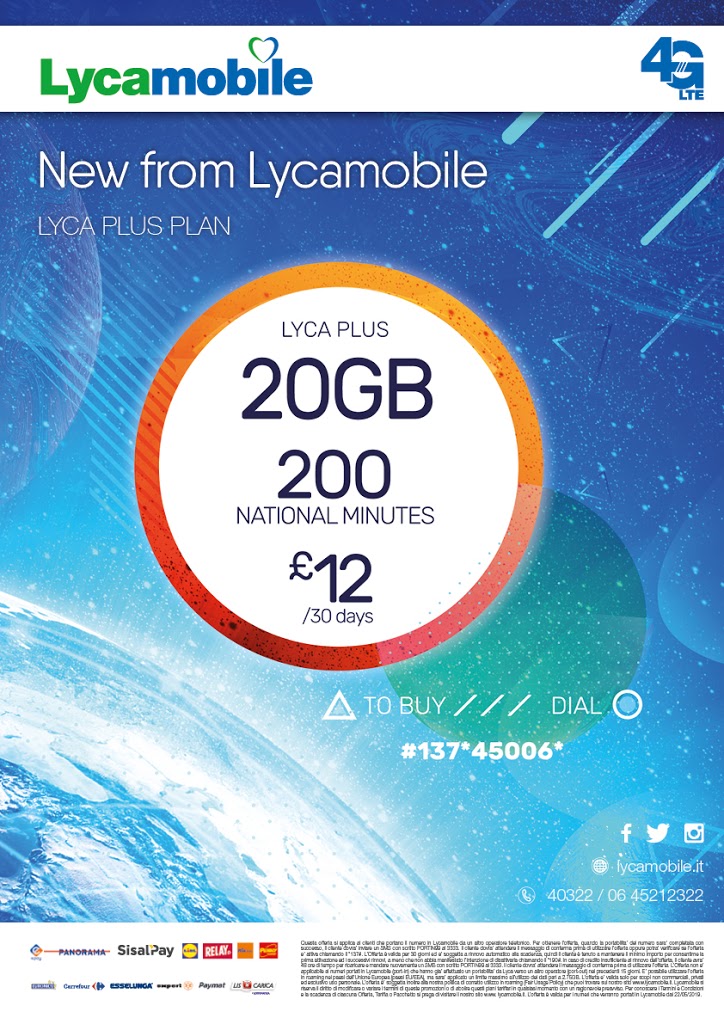
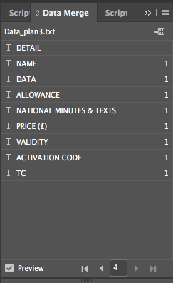
Recent poster created using Data-Merge fields and CSV sheet (fig.1)

Usually purposed for books or large publicaions, Data merge allows referencing of CSV values in order to populate specific fields/boxes within the poster/artwork.
Benefits of this include:
- Automatic transposition of other data sets used internally
- Remove possibility of typos
- Swift and accurate switching up of data fields
- Allows designers to focus on design aspects rather than re-typing information
- Automatic, multi variant publication from templates generating different values in each export (automatically)
In order to reveal the Data-Merge window, navigate to Top Bar Menu > Window > Utilities > Data Merge. From here it is clearly explained how to populate/import each field from a CSV/TXT file editable in Microsoft Excel software.
Lead Image LMES


