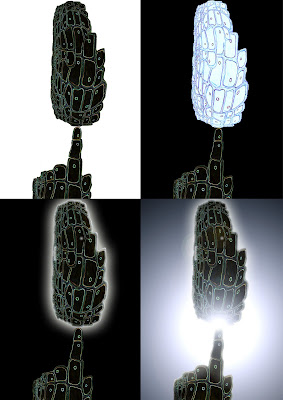
Lightspeed rendition taken using the canvas painting I made a few weeks ago. The result of extra exposure and a radial blur, this reminded me of the effect used in the Star-Wars films, which was actually developed by John Whitney in the early days of CGI. I really like the high speed effect of this blur and animating it would not be too dificult, simply by exporting a cumulative blur then putting it into Flash. I am currently working on the idea of having some kind vessel travelling in 3rd person aswell. Dean Moore a VJ I am currently collaborating on this idea with has also suggested animating panels and structural parts building up on a wire frame of the vessel as it is travelling through space.
Author: adarabi
Cell Form
Smoke Experiment
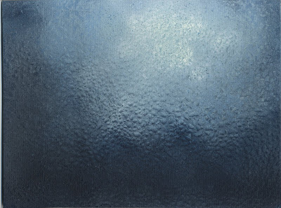
Here are a few snapshots of a glass speaker-box i built in an attempt to show the movement of smoke when sound travels through it. Unfortunately there was no noticable movement or formation of patterns shown.
FUTURE DEVELOPMENT:: Find a different medium to pass the soundwaves through (in air). Continue experimenting with various frequencies and different types of music and sound. Look more at the physics of sound and develop a way of illustrating how sound passes through air.
Haeckel


An artist/scientist’s impression of cells. These illustrations could be seen as a convergence of art and science. Where they serve the purpose of illustrating a physical thing the naked eye is unable to see, but also something that is quite interesting to look at. The last example shows some structural properties of the cell, with the triangular frame Haeckel has named ‘aulosphaera elegantissima’. I am not sure what this means but I am intrigued that he has demonstrated the formation of matter with this structure. I see many similarities between this drawing and my study of cymatics. It is also present in nature in the form of flowers, the organic pinnacle of form in plants.
Thumb Sketches
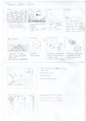
Here are some of my initial thoughts on what I could make as individual loops that can be mixed together. Over the next week I will also be sketching out variations on these ideas and making different experiments with texture and special effects. Water is a recurring theme throughout, and something I feel I can expand on in different ways. The amoebic cell like forms are also a recurring pattern, something that will help bind the different scenes together when it comes to mixing them.
Adam Neate
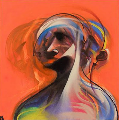
Portraight by Adam Neate, A contemporary artist, involved in the guerrilla/street art movement of recent times. Taken from the La Boca Design blog. The sense of movement in this portraight gave me the idea of painting multiple frames in an almost Cubist fashion, played in sequence to give a body movement. From this painting you can also see the slightly abstracted approach I am interested in taking.
Scuba Scene
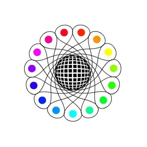
Spirographic
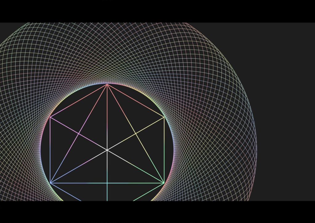
Although this is quite a primitive example, I am interested in persuing some pattern combinations that give a psychedelic appearance when put into motion. I think spirograph looks alot cleaner and nicer when it is a still image. Below is the finished example of the concept art I am putting forward to be animated.
Moode Board
Apres La Pluie

I really liked the style of this film shown in last year’s cinema screening. It is a student film from the Gobelins schhol of 2008. The way in which water is animated in this video is really nice, and i especially liked the underwater scene, where the light is passing through the water above. The character design of the fish creature is very imaginative and is the kind of thing I would really like to incorporated into my work. The closing shot of the city in the clouds is also extremely stylistic. Although this kind of animation is quite different to most of my recent influences, I think it is really crucial to make reference to a wide variety of styles, especially when it has so much soul and uniqueness. Some of the abstract, minimal designs can look abit flat after a while, so hopefully this is a level of animation I can work towards, with a foundation in basic colour and graphic concepts. Click the image for a larger rendition of the scenes.


