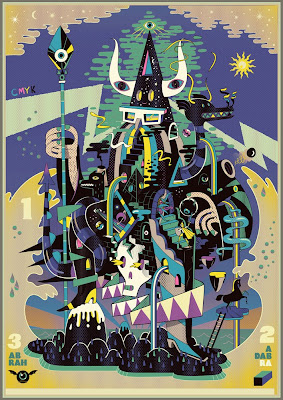
I have been exploring the work of this illustrator/animation director recently and really taking a liking to his bold, colourful, surreal style. This is just one of his many illustrations. What I really like is the way he exaggerates certain aspects of the human form and also the way each of his paintings is almost a microcosm of narrative. Above is a prime example of this, entitled Abrah Ka Dabrah. Again I urge you to check out the rest of his work at www.stevescott.au if you like this kind of style also check out Laboca design house and Will Sweeney who all share the technique of using stark, bold lines and colours to depict slightly mind-bending subject matters. Also check out the latest music video for Birdy Nam Nam produced by Scott and Sweeney! It really is quite mental, but a brilliant rendition none the less, encorporating many different forms of animation from 3D to hand drawn. I really love the concept aswell!
Author: adarabi
Luuurved this animation on the BoomTownFair homepage. It also reminded me slightly of the planets created by Jakub Dvorský aka Amanita Design, who compiled photos taken from forest woodland to create the tiny microcosm/home planet of the main character from the story. I actually saw Jakub give a talk at the Bradford animation festival, describing how he went about this and the process of making the point and click game Samorost. which if you haven’t played already, definitely check it out! He has also made a few new games since, including Samorost 2 and Machinarium. The music in this is absolutely brilliant aswell as the artwork and originality. Here is the planet I was talking about:
I made this book cover in response to an open brief set by Penguin Books. I used an experimental method of pressing paint onto the page and then rubbing pastel colour across it. The white line graphics provide a contrasting 2D overlay and representation of the word itself “Waves”. I will endeavor to read the book and produce a more meaningful rendition. Coming soon!
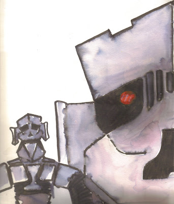
Rob
Meet Rob, he is an old skool robot I designed and built from polystyrene. Despite his outward appearance he is actually abit of a softy (in his old age). There is something about the antiquated look of heavy humanoid robots that highlights the inadequacies of machines and their stupidity, in that they cannot perform any task by themselves. Rob is designed around a mixture of influences from the Iron Giant, Kryten from Red Dwarf and Terminator. The watercolour technique I employed was meant to give the impression of a hard, reflective surface in contrast to the bold, dark outlines.
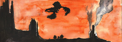
These concept drawings are part of a Sci-fi story I have recently come back to, having laid out the foundations of the idea a few years ago. The first was made using Oils and the second using Inks. The inks helped to portray the clouds alot more effectively and eerily, but the oils did a better job of showing the ground details and tones. See what you think anyway, and don’t be scared! its just a story 🙂 The black cloud in the second image is meant to be a swarm of killer robots (nano robots) that fly! A scary concept if I do say so myself. Hopefully it will never take shape, unless its more like the robot Eva from Wall-e, who is awesome! 🙂
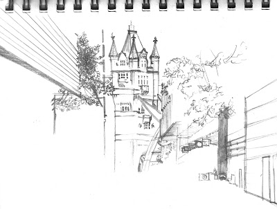
More Place, London Bridge
Here is a quick sketch I made of More Place, right beside the new Shard building in London Bridge. The street has a small river running down the centre of it. I really loved this idea, conceived by Townshend Landscape Architects, and when I noticed Tower Bridge at the end of the street I knew that the bridge had to be the inspiration for the stream, as well as being inspiration for most of the architecture, whereby it is meant to compliment and enhance its surroundings aswell as providing a functional space. I am currently planning an event to be held on this street. Although ambitious, I think it would be a fantastic way of encouraging new and raw talent to the engineering community. Thats all I can say for the moment, but watch this space¬! The finished drawing will reveal all! Reference photograph: More Place, London Bridge
LINK
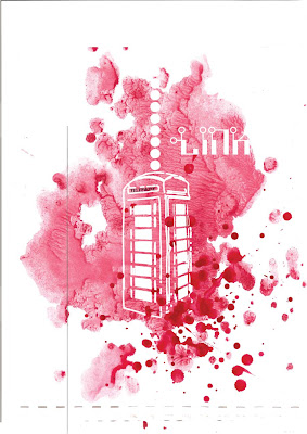
A homage to post boxes and the bright red colour they brought into our lives! I used a combination of watercolour and illustrator to produce the effect of the red colour being displaced by the heavy looking phone-box. It is also perhaps playing on the idea of the Doctor Who tardis (Time And Relative Dimension in Space, police-box) probably actually closer to the Bill&Ted time machine! Excellent!
Updated Heart Design
Da Londra T’s :D
T-Shirt designs for Da-Londra. Really loving the new Illustrator CS6, finding the interface extremely intuitive and logical. Although having used the previous version of CS4 I guess it has not changed that much. The colours I have used here are not the official T-Shirt colours, which I am guessing will be something like fruit of the loom colours, but it definitely showed up some of the possible printing dangers that might occur i.e. clipping and spilling! Hopefully the bike in this instance should be simple and bold enough to avoid these problems, but if not I will definitely have to reconsider my approach to this one! Check out the selection of products here: www.dalondra.com

Comic strip stylee deck designs I was asked to produce by Faltown Skateboards. I used ‘The Rasterbator’ (an online image processor that can create huge dot matrix images) to fill in the dark patches of a photograph taken from the Hubble Space Telescope (hope the copyright is not too tight). This hopefully helps to fuse together the bold vector graphics with the background.
I also like this effect because it massively simplifies and vectorises the background, contrary to the infinite nature of the subject (space) giving an interesting juxtaposition. This technique was mainly inspired by comic book print patterns and also the video, Parachute ending, directed by Will Sweeney and Steve Scott. Check it! (if you dare ;/) Also check out Scott’s website http://www.stevescott.com.au/

