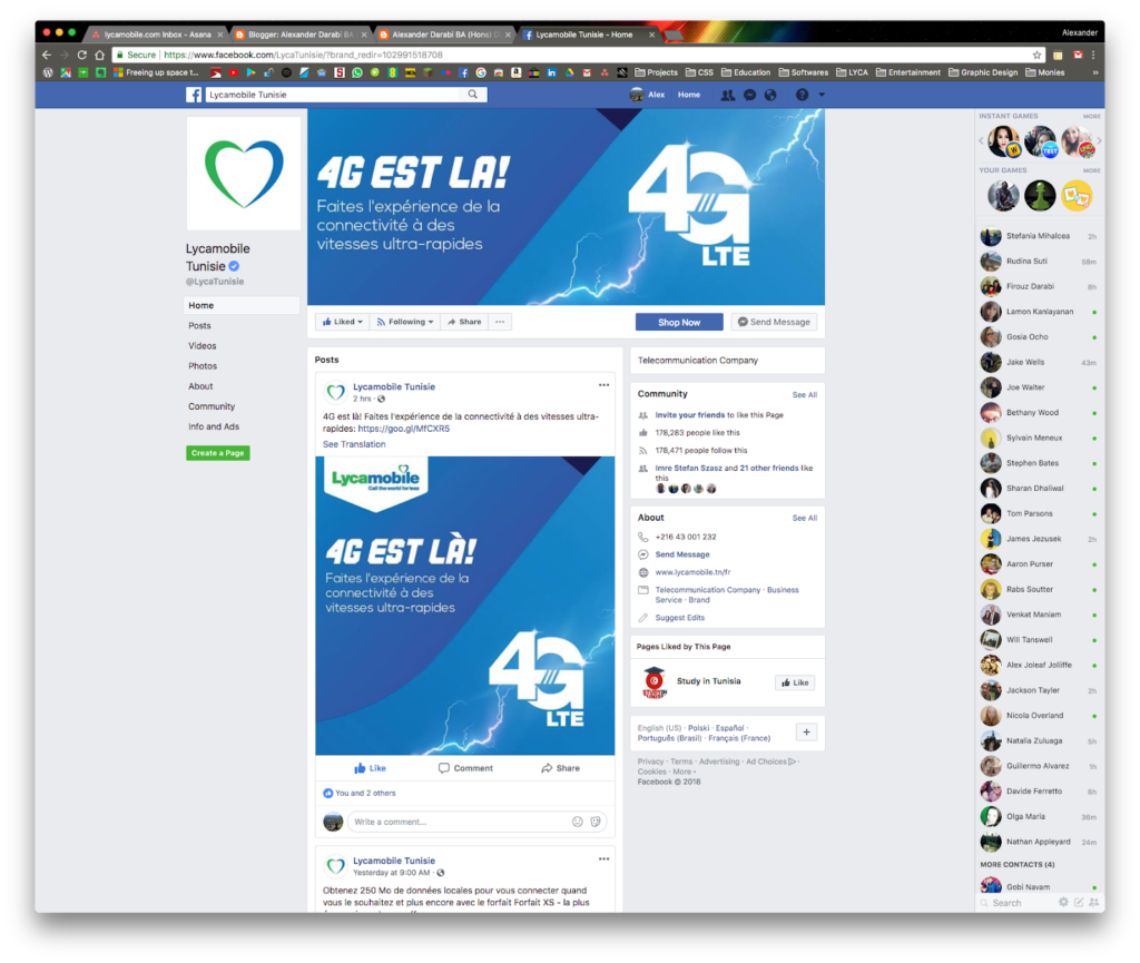
Good example of copy-led creativity in design. Trying to keep the design as eye-catching yet simple as possible I used the Lycamobile 4G symbol (used across all countries with 4G support) with a vector based lightning element. This sharp contrast on the blue gradient helps it to stand out from the crowd even more than previous 4G launch campaigns.
Heading font = Commando. Future Development :: Work on more vector based illustrations using lighting effects and gradients.


